Pivot Table Excel Tutorial: Complete Beginner to Advanced Guide 2026 July
Learn pivot in excel with this complete pivot table tutorial. 🧠 Create, filter, group, and analyze data with step-by-step examples for beginners and pros.

Learning how to build a pivot in excel is one of the highest-leverage skills any analyst, accountant, or business user can develop. A pivot table takes thousands of raw rows and condenses them into a clean summary you can slice by date, region, product, or any field in seconds. Instead of writing dozens of SUMIF or COUNTIF formulas, you drag fields into rows and columns, and Excel handles the math automatically. Once you understand the four-quadrant model, you can analyze almost any dataset in minutes.
This tutorial walks through pivot tables from the very first click to advanced techniques like calculated fields, slicers, timelines, and refreshable data models. Whether you are a student preparing for an exam, an analyst building a monthly report, or a manager who just wants to stop staring at endless spreadsheets, the concepts here will pay dividends every workday. We will cover Excel 2016, 2019, 2021, and Microsoft 365 because pivot tables behave nearly identically across these versions.
Before we begin, it helps to know how pivot tables fit into the broader Excel toolkit. They sit alongside vlookup excel, INDEX/MATCH, Power Query, and Power Pivot as the core data-analysis features. While vlookup pulls a single matching value from a lookup table, a pivot table summarizes large quantities of data using counts, sums, averages, and percentages. Knowing when to use which tool is half the battle, and we will discuss that decision throughout the guide.
A clean source dataset is the foundation of every successful pivot table. Your data should be in tabular form: one row per record, one column per field, no merged cells, no blank rows, and no totals embedded in the middle. If you have wondered how to merge cells in excel for a report header, that is fine for presentation, but never merge cells inside a pivot source range. Pivot tables read the first row as field names, so make sure each column has a clear, unique header.
You will also want to convert your source range to an Excel Table (Ctrl+T) before inserting the pivot. Tables automatically expand when you add new rows, which means your pivot refresh picks up new data without re-pointing the source. This is a small habit that prevents huge headaches months later when someone asks why the August numbers are missing from the report.
Throughout the tutorial we will use a sample sales dataset with columns for Order Date, Region, Salesperson, Product, Units, and Revenue. You can replicate it in a few seconds, or download similar data from any sample workbook. By the end of the article, you will know how to build summaries by region, group orders by month and quarter, calculate profit margins on the fly, and present everything with slicers and timelines.
Finally, treat this guide as both a learning resource and a reference. Bookmark it, work through the examples once, and come back when you need a specific technique. Pivot tables reward repetition more than memorization, so the best way to internalize the workflow is to build five or six pivots from your own data this week. Let us get started with the numbers behind why this skill matters.
Pivot Tables by the Numbers

Pivot Table Building Blocks
The top zone acts as a page-level filter, letting you slice the entire pivot by one or more field values without changing the row or column layout.
Fields dragged here become column headers. Use it for time periods, categories, or any dimension where you want side-by-side comparisons across the report.
Fields placed in rows form the primary breakdown of your data. You can nest multiple fields for hierarchical drill-downs, such as Region then Salesperson.
Numeric fields go here to be aggregated. Excel auto-detects whether to sum or count, but you can change the calculation, format, and show-as options.
The right-hand pane lists every column from your source and lets you drag fields into the four zones. Check boxes assign fields to default areas instantly.
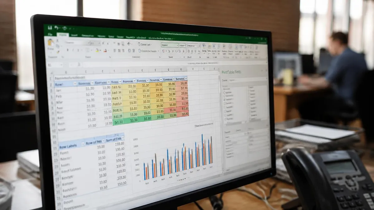
Creating your first pivot table takes about thirty seconds once you know the steps. Click anywhere inside your data range, go to the Insert tab, and choose PivotTable. Excel will guess the range based on contiguous cells, but you can override it. Choose to place the pivot on a New Worksheet for clarity, then click OK. A blank pivot canvas appears on the left and the PivotTable Fields pane opens on the right, listing every column header from your source.
To build a summary by region, drag the Region field into the Rows area and Revenue into the Values area. Instantly you see total revenue per region. Drag Product into the Columns area and you now have a two-dimensional matrix: revenue by region across products. This drag-and-drop interactivity is what makes pivot tables transformational, you can restructure a 50,000-row dataset into any view in seconds without writing a single formula.
If your source data lives somewhere you reference often, you might already know how to freeze a row in excel to keep headers visible while scrolling. Pivot tables make that habit less critical because the summary is compact, but if you build long pivots with hundreds of rows, freezing the top row still helps. Use View → Freeze Top Row to keep the column headers anchored as you scroll through the pivot output.
A common beginner mistake is dropping a text field into the Values area. Excel cannot sum text, so it defaults to Count instead. That is sometimes what you want, like counting the number of orders per region. But if you wanted revenue and accidentally see Count of Revenue, double-click the field heading and change Summarize Values By to Sum. The dialog also offers Average, Max, Min, Product, Count Numbers, StdDev, Var, and a few others.
Number formatting deserves special attention. By default, pivots inherit no formatting from the source, so dollar amounts may show as raw decimals. Right-click any value cell and choose Number Format (not Format Cells) to apply currency, percentage, or accounting formatting. The key difference is that Number Format persists when you refresh or rearrange the pivot, while regular cell formatting can vanish when the layout changes.
Layout choices matter too. The default Compact Form stacks row fields in one column, which saves space but can be hard to read. Switch to Outline Form or Tabular Form via PivotTable Design → Report Layout for more traditional spreadsheets-style output, especially if you plan to copy the pivot into a presentation or printed report. Tabular Form also makes it easier to convert the pivot to plain values later.
Finally, do not forget Refresh. Pivot tables hold a cached copy of your source data, so adding or editing rows does not update the pivot automatically. Right-click anywhere in the pivot and choose Refresh, or press Alt+F5. To refresh every pivot in the workbook, use Ctrl+Alt+F5. If you converted the source to an Excel Table first, the refresh will automatically include any new rows you appended below the original data.
Microsoft Excel Practice Test Questions
Prepare for the Microsoft Excel exam with our free practice test modules. Each quiz covers key topics to help you pass on your first try.
Microsoft Excel Excel Basic and Advance
Microsoft Excel Exam Questions covering Excel Basic and Advance. Master Microsoft Excel Test concepts for certification prep.
Microsoft Excel Excel Formulas
Free Microsoft Excel Practice Test featuring Excel Formulas. Improve your Microsoft Excel Exam score with mock test prep.
Microsoft Excel Excel Functions
Microsoft Excel Mock Exam on Excel Functions. Microsoft Excel Study Guide questions to pass on your first try.
Microsoft Excel Excel MCQ
Microsoft Excel Test Prep for Excel MCQ. Practice Microsoft Excel Quiz questions and boost your score.
Microsoft Excel Excel
Microsoft Excel Questions and Answers on Excel. Free Microsoft Excel practice for exam readiness.
Microsoft Excel Excel Trivia
Microsoft Excel Mock Test covering Excel Trivia. Online Microsoft Excel Test practice with instant feedback.
Microsoft Excel Advanced Data Analysis Tools
Free Microsoft Excel Quiz on Advanced Data Analysis Tools. Microsoft Excel Exam prep questions with detailed explanations.
Microsoft Excel Advanced Formula and Macro...
Microsoft Excel Practice Questions for Advanced Formula and Macro Creation. Build confidence for your Microsoft Excel certification exam.
Microsoft Excel Advanced Formulas and Macros
Microsoft Excel Test Online for Advanced Formulas and Macros. Free practice with instant results and feedback.
Microsoft Excel Basic and Advance Question...
Microsoft Excel Study Material on Basic and Advance Questions and Answers. Prepare effectively with real exam-style questions.
Microsoft Excel Creating and Managing Charts
Free Microsoft Excel Test covering Creating and Managing Charts. Practice and track your Microsoft Excel exam readiness.
Microsoft Excel Data Visualization with Ch...
Microsoft Excel Exam Questions covering Data Visualization with Charts. Master Microsoft Excel Test concepts for certification prep.
Microsoft Excel Formulas and Functions
Free Microsoft Excel Practice Test featuring Formulas and Functions. Improve your Microsoft Excel Exam score with mock test prep.
Microsoft Excel Formulas and Functions App...
Microsoft Excel Mock Exam on Formulas and Functions Application. Microsoft Excel Study Guide questions to pass on your first try.
Microsoft Excel Formulas Questions and Ans...
Microsoft Excel Test Prep for Formulas Questions and Answers. Practice Microsoft Excel Quiz questions and boost your score.
Microsoft Excel Functions Questions and An...
Microsoft Excel Questions and Answers on Functions Questions and Answers. Free Microsoft Excel practice for exam readiness.
Microsoft Excel Managing Data Cells and Ra...
Microsoft Excel Mock Test covering Managing Data Cells and Ranges. Online Microsoft Excel Test practice with instant feedback.
Microsoft Excel Managing Tables and Data
Free Microsoft Excel Quiz on Managing Tables and Data. Microsoft Excel Exam prep questions with detailed explanations.
Microsoft Excel Managing Tables and Table ...
Microsoft Excel Practice Questions for Managing Tables and Table Data. Build confidence for your Microsoft Excel certification exam.
Microsoft Excel Managing Worksheets and Wo...
Microsoft Excel Test Online for Managing Worksheets and Workbooks. Free practice with instant results and feedback.
Microsoft Excel MCQ Questions and Answers
Microsoft Excel Study Material on MCQ Questions and Answers. Prepare effectively with real exam-style questions.
Microsoft Excel Questions and Answers
Free Microsoft Excel Test covering Questions and Answers. Practice and track your Microsoft Excel exam readiness.
Field Settings, Calculations, and Show Values As
The Summarize Values By menu controls the aggregation function applied to numeric fields. Sum is the default for numbers, but you can switch to Average, Count, Max, Min, Product, Count Numbers, StdDev, StdDevp, Var, or Varp. Each option matches a standard statistical function, so Average mirrors AVERAGE() and StdDev mirrors STDEV.S(). Right-click any value cell and choose Summarize Values By to access the menu without opening the field settings dialog.
Pick the calculation that answers your actual business question. Sum of Revenue answers total sales. Count of Order ID answers number of transactions. Average of Order Size answers typical deal size. You can place the same field in the Values area multiple times and assign different calculations to compare them side by side, such as Sum, Count, and Average of Revenue in three adjacent columns.

Pivot Tables vs. Traditional Formulas
- +No formula writing required for most summaries
- +Drag-and-drop restructuring takes seconds
- +Handles millions of rows without slowdowns
- +Built-in grouping for dates, numbers, and text
- +Slicers and timelines create interactive dashboards
- +Refreshable when source data updates
- +Multiple aggregations in one report
- −Cached data must be refreshed manually
- −Source must be in clean tabular format
- −Calculated fields are less powerful than DAX
- −Formatting can reset on layout changes
- −Cannot reference pivot cells with standard formulas easily
- −Steep learning curve for advanced features
- −Hard to audit if logic is complex
Pivot Table Setup Checklist
- ✓Confirm source data has no blank rows or merged cells
- ✓Verify every column has a unique header in row 1
- ✓Convert source range to an Excel Table with Ctrl+T
- ✓Choose New Worksheet placement for the pivot
- ✓Drag dimensions to Rows and Columns, measures to Values
- ✓Change Summarize Values By if Excel guessed wrong
- ✓Apply Number Format (not Cell Format) to value fields
- ✓Switch Report Layout to Tabular Form for cleaner output
- ✓Add slicers or a timeline for interactive filtering
- ✓Refresh the pivot whenever source data changes
Reference pivot cells safely
When you click a pivot cell from another formula, Excel inserts a GETPIVOTDATA function instead of a normal cell reference. This is intentional, it ties the formula to a logical pivot intersection, not a cell address that may shift on refresh. You can disable it via PivotTable Analyze → Options → Generate GetPivotData if you prefer plain references, but GETPIVOTDATA is more robust for dashboards.
Grouping is one of the most underused pivot table features. Right-click any date field in a pivot and choose Group, and Excel lets you roll the dates up by seconds, minutes, hours, days, months, quarters, or years. You can pick multiple levels at once, so a single date column can produce a Year → Quarter → Month hierarchy with three clicks. This eliminates the need for helper columns and TEXT formulas that beginners often build to convert dates into period buckets.
Numeric grouping works the same way. Right-click a numeric row field, choose Group, and set a start, end, and interval. This is perfect for binning ages into ten-year cohorts, order sizes into revenue tiers, or scores into letter-grade bands. The bins behave like any other field, so you can sort, filter, and apply calculated fields to them. The only catch is that grouped numeric fields must contain numbers only, no blanks or text values mixed in.
Text grouping requires manual selection. Hold Ctrl, click the items you want to group, right-click, and choose Group. Excel creates a new field one level above with default labels like Group1 and Group2. Rename them in the formula bar, and you have effectively created a new category from existing items, no source data edits required. This is great for ad-hoc rollups like grouping individual states into sales territories.
Sorting pivot tables is more flexible than sorting plain ranges. Right-click any row label and choose Sort to order ascending, descending, or by a value column. Sort by Values lets you order regions by total revenue, or sort products by average margin, all without touching the source. Manual sort is also available, just drag a row item to a new position and the pivot remembers it across refreshes. This is useful when you want a custom order like Small, Medium, Large.
Filtering inside a pivot has three layers. The Filters drop zone creates page-level filters that affect the whole pivot. Row and column labels each have their own filter dropdowns, which behave like AutoFilter but apply only inside the pivot. Value filters let you keep only items where a measure meets a condition, such as Sum of Revenue greater than $100,000. Label filters allow text patterns like begins-with or contains, similar to a wildcard search.
If you find yourself doing the same filtering repeatedly, build a slicer instead. Slicers are buttons that visually filter the pivot, and they can connect to multiple pivots simultaneously via Report Connections. A single slicer on Region can drive five pivots and three charts on the same dashboard. Insert one from PivotTable Analyze → Insert Slicer, then right-click the slicer to access Report Connections and tick every pivot that should respond to it.
Timelines are slicers specialized for date fields. Insert one from PivotTable Analyze → Insert Timeline, pick the date column, and you get a horizontal time scrubber that filters by day, month, quarter, or year. Timelines look clean on dashboards and are far more intuitive than nested date filters. Combine slicers and timelines for fully interactive reports that managers can drive themselves without touching the underlying pivot.
If your pivot shows (blank) labels, mysterious extra rows, or refuses to group dates, the culprit is almost always source data. Check for empty rows interrupting the table, dates stored as text, numbers stored as text, merged cells, or extra header rows. Clean these before troubleshooting the pivot itself. The pivot is rarely broken, the data underneath usually is.
Advanced pivot work begins when you connect the pivot to a Data Model instead of a single range. On the Insert PivotTable dialog, tick Add this data to the Data Model. This loads your source into Power Pivot, where you can build relationships between multiple tables, write DAX measures, and create pivots that span related datasets, like Orders linked to Customers linked to Products. Once you taste this, you rarely go back to single-source pivots for serious work.
DAX measures are the upgrade path beyond calculated fields. Instead of =Revenue/Units, you write Profit Margin := DIVIDE(SUM(Sales[Revenue]) - SUM(Sales[Cost]), SUM(Sales[Revenue])). DAX handles context automatically, so the measure recalculates correctly for any combination of filters, slicers, and row/column dimensions. Functions like CALCULATE, FILTER, and ALL unlock metrics that calculated fields simply cannot produce, such as year-over-year growth and same-store sales.
Data preparation often happens in Power Query before the pivot ever sees the data. From Data → Get Data, you can load CSV files, web tables, databases, and folders, then clean and reshape them with point-and-click steps. Remove duplicates, split columns, unpivot crosstab data, and merge tables, all without writing code. Speaking of remove duplicates excel, Power Query handles it more flexibly than the built-in tool, letting you remove duplicates based on a subset of columns with full undo history.
For interactive reports, learn how to create a drop down list in excel using Data Validation, then tie the dropdown selection to your pivot using slicer Report Connections or a small VBA macro. This pattern lets non-technical users pilot a complex pivot dashboard with simple dropdowns instead of digging through filter menus. The same idea applies to form controls, which can drive pivot filters via macros for fully bespoke user experiences.
Pivot charts deserve their own mention. Click any pivot, then Insert → PivotChart, and you get a chart bound to the pivot. Filter the pivot and the chart updates. Add slicers and both filter together. Pivot charts have limitations, no scatter plots or stock charts, but for bar, column, line, and pie visuals, they are the fastest way to turn a pivot into a presentation-ready graphic. Just be sure to remove the field buttons via Field Buttons → Hide All before sharing.
Performance matters once data grows past a few hundred thousand rows. Tips: avoid placing high-cardinality text fields like Order ID in Rows, since each unique value creates a row. Disable Show items with no data on fields where it does not matter. Use the Data Model for sources over 1 million rows, since classic pivots cap there. And do not stack five calculated fields on a single pivot if you can replace them with one DAX measure.
Finally, learn to convert a pivot to values when you ship a final report. Copy the pivot, then Paste Special → Values. The result is a plain table with no refresh dependency, ideal for emailing to stakeholders who do not have access to your source data. Keep the original pivot in a hidden sheet for next month, so you can refresh and re-export in one click rather than rebuilding from scratch.
To cement what you have learned, build five pivots this week from real data you care about. Use your bank statement to summarize spending by category, your fitness app export to chart workouts by month, or your team's project tracker to count tasks by owner. The act of choosing fields, fixing errors, and refining layouts will teach more than reading another tutorial. Save each pivot with notes on what worked and what surprised you, and you will internalize the workflow within a few sessions.
Keyboard shortcuts speed everything up. Alt+N+V opens the Insert PivotTable dialog. Alt+JT switches to the PivotTable Analyze ribbon in newer Excel versions. F5 then click Special → Visible cells only helps when copying filtered pivots. Ctrl+Shift+L toggles AutoFilter on the source. And do not forget Alt+F5 to refresh the active pivot, the single most-used shortcut once you build dashboards that depend on fresh data.
Documentation habits separate hobbyists from professionals. Add a separate sheet at the front of every pivot-driven workbook that lists the source location, refresh instructions, last refresh date, and any calculated field formulas. Six months from now, when someone asks how a number was derived, you will thank yourself. If multiple people share the workbook, lock the pivot sheet so only authorized users can edit field arrangements, while leaving slicers and timelines unlocked for interactive use.
Pivot tables also pair well with conditional formatting. Select the value area, then Home → Conditional Formatting → Data Bars or Color Scales. Choose the option that says All cells showing values for the field, so the formatting persists when filters change. Top/bottom rules highlight the best and worst performers automatically, perfect for management reports where you want red and green flags rather than long discussions about thresholds.
Common interview questions about pivots focus on use cases and limitations. Be ready to explain when to use a pivot versus a SUMIFS formula, when to choose Power Pivot over a classic pivot, and how to handle messy source data. Hiring managers also like to ask about calculated fields versus calculated items, since confusing the two reveals shallow understanding. Practice these answers out loud, and have a sample workbook ready to demo your skills in screen-share interviews.
If you are studying for certification exams like the Microsoft Office Specialist (MOS) Excel Expert, pivot tables make up a substantial chunk of the practical tasks. Expect to be asked to create a pivot, add a slicer, group dates, add a calculated field, and change Show Values As settings under time pressure. Drill these steps until they feel automatic. The exam rewards muscle memory more than theory, so the more pivots you build in practice, the more confident you will feel on test day.
The journey from beginner to pivot table power user usually takes two or three months of regular use. After that, the gains keep coming as you layer in Power Query, Power Pivot, and DAX. Pivot tables are the gateway drug to the entire Microsoft data stack, and the patterns you learn here scale directly to Power BI when you are ready for that next step. Keep practicing, keep questioning your data, and the spreadsheets will keep getting smarter.
Excel Questions and Answers

Standard Deviation Formula in Excel: STDEV.P vs STDEV.S Guide

How to Add a Filter in Excel: AutoFilter, Advanced and FILTER Function

Freeze Panes in Excel: Complete Guide to Locking Rows and Columns

Count Unique Values in Excel: COUNTUNIQUE, COUNTIF, and SUMPRODUCT Methods

How to Calculate Coefficient of Variation in Excel: Complete Step-by-Step Guide
About the Author
Business Consultant & Professional Certification Advisor
Wharton School, University of PennsylvaniaKatherine Lee earned her MBA from the Wharton School at the University of Pennsylvania and holds CPA, PHR, and PMP certifications. With a background spanning corporate finance, human resources, and project management, she has coached professionals preparing for CPA, CMA, PHR/SPHR, PMP, and financial services licensing exams.